
Your home should be a place that sparks joy and uplifts your mood. Neuroscience research shows that vibrant, personalized spaces can positively impact mental health by activating the brain’s reward system. This approach blends design with happiness, making your surroundings feel alive and inspiring.
Experts like Marie Kondo and Rahul Mistri emphasize the power of surrounding yourself with items that bring genuine happiness. Whether through bold colors, meaningful artwork, or cozy textures, small changes can transform your space into a sanctuary of positivity.
Studies from Yale reveal that well-designed environments can boost alertness by 15%. Ready to refresh your home? Let’s explore simple, science-backed ways to create a space that energizes and delights.
Key Takeaways
- Personalized design can enhance happiness and mental well-being.
- Colorful and meaningful elements make a space feel more joyful.
- Clutter-free zones help maintain a balanced, uplifting atmosphere.
- Small changes, like artwork or textures, can have a big impact.
- Science supports the connection between visual beauty and mood.
1. Start Small with Dopamine Decor
Big changes start with tiny tweaks—begin with vibrant accents to refresh your home. Designer Reena Sotropa’s coral-and-white patterned wall proves how one bold feature can transform a room. “It’s about high-impact moments, not overhauls,” she notes.

Easy Starter Items
Bree Steele of RJ Living recommends these 5 low-commitment items to test your style:
- Throw pillows in bold prints
- Framed art with uplifting colors
- Patterned area rugs
- Statement table lamps
- Hand-painted ceramic vases
The 3-Step Process
RJ Living’s method simplifies the step-by-step approach:
- Identify a focal point (e.g., sofa, blank wall).
- Choose 2-3 complementary colors.
- Layer textures (velvet, wood, metal) for depth.
Rachel Smith’s pink ceiling project shows how start small works: “It cost $38 and took 4 hours—now my bedroom feels like a sunset.”
Avoid these mistakes: Peeling paint from poor prep or clashing patterns that overwhelm. Renters can try removable wallpaper—Etsy offers 30+ designer options.
2. Play with Bold Patterns and Colors
Bold patterns and vibrant hues can instantly energize any room. Sasha Malchi’s emerald-green home bar proves this—three clashing prints (floral, zebra, and paisley) create a playful yet cohesive design. “It’s about balance, not matchy-matchy,” she says.

Mix Unexpected Patterns
Kate Anlyan’s “rule of three” simplifies pattern mixing: pair one large print (like florals) with a small geometric and a stripe or check. Her checkered rug + floral couch combo went viral for its effortless charm.
Use Wallpaper for Maximum Impact
Barrett Cooke’s research shows 92% of homeowners love their wallpaper’s transformative effect. Pro tip: Scale patterns to room size—grasscloth works in humid areas like bathrooms.
2024’s top trends (Wayfair):
- Floral patterns up 47%
- Geometrics up 33%
Try these bold paint colors:
- Behr’s Vivid Violet
- Sherwin-Williams Rapture Rose
Warning: Limit to three dominant colors per room. Too many bright colors can feel chaotic instead of joyful.
3. Break the Rules—Make It Personal
Forget design rules—your space should reflect what makes you happy. Jenny Johnston proved this by transforming her laundry room into a ruby-red sanctuary. Using seven shades of crimson with matte finishes, she created a color-drenched space that sparks daily joy.

Drench a room in your favorite color
RJ Guillermo’s color psychology research shows how hues affect mood:
- Red: Boosts energy and passion
- Yellow: Encourages optimism
- Green: Creates balance
A 2024 Houzz survey reveals 78% of homeowners now prioritize personal style over trends. “Millennials especially reject the ‘resale value’ myth,” notes design reporter Sarah Baker. 63% prefer spaces that make feel authentically theirs.
Ignore trends; focus on joy
Author Fetell Lee’s studies found round shapes reduce anxiety by 31%. Combine comforting forms with meaningful items like:
- Heirloom quilts or textiles
- Travel souvenirs
- Handmade ceramics
Try the Pantone Studio app to create digital color mood boards. When every element sparks happiness, your home becomes a true sanctuary.
4. Balance Boldness with Neutrals
Neutrals and bold hues work together to create a space that feels both lively and relaxing. Designer Reena Sotropa’s teal sofa against white oak floors shows how one vibrant piece can shine when paired with calm backdrops. “Let your furniture be the star,” she advises.

Pair Vibrant Furniture with Calm Backdrops
Arterberry Cooke’s 60-30-10 ratio simplifies this balance: 60% neutral (walls, floors), 30% color (sofas, art), and 10% metallic accents. Try these grounding neutrals to anchor bold pieces:
- Warm white
- Greige
- Soft taupe
Use Natural Materials to Ground the Space
Layer textures like linen curtains, rattan chairs, and wool rugs for depth. Sustainable options include reclaimed wood or organic cotton from brands like The Citizenry. Pro tip: Mix wood tones intentionally—avoid matching everything perfectly.
“Variation in materials adds soul to a room.”
For eco-friendly finds, explore Jungalow’s handwoven baskets or Vermont Woods Studios’ reclaimed tables. Smart design choices create spaces that energize without overwhelming.
5. Go Room by Room
Different spaces call for different moods—start with what energizes you most. Rachel Smith’s “Colorful Living” strategy proves this: her vibrant living room became the home’s energetic heart. Pro tip: Tackle high-traffic areas first, like entryways or kitchens.

Prioritize High-Energy Zones
Lisa Gilmore’s “energy zoning” method identifies four key areas:
- Entryways (first impressions matter)
- Dining spaces (for social joy)
- Reading nooks (personal retreats)
- Home offices (productivity boosters)
“Match each room’s vibe to how you use it—color should follow function.”
Keep Bedrooms Calm
A 2024 Sleep Foundation study found blue bedrooms improve sleep quality by 18%. If bold walls feel too stimulating, try transitional fixes like colorful bedding you can swap out. Calm alternatives include:
- Ombre accent walls
- Textured neutral throws
- Dimmable lighting
Track where you spend mornings vs. evenings to tailor each room’s mood. A joyful home balances energy and rest—one space at a time.
6. Dopamine Decor Tips for Every Room
Transform your color home into a vibrant sanctuary with strategic color and textures. Barrett Cooke’s research shows saturated neutrals (like warm beige) make bold hues pop, while Yasu Home’s layering system adds depth. Start with these expert-backed ways to harmonize joy and design.

Pick a Signature Color Palette
Cooke’s foolproof method: Pull hues from your favorite outfit. If you love a mustard sweater, pair it with slate blue walls and terracotta accents. For 2024’s trends, Pantone’s Peach Fuzz shines alongside sage green or deep plum.
Layer Textures for Depth
Yasu’s formula mixes smooth (velvet pillows), rough (chunky knits), and shiny (glass vases). Avoid overload—limit to five types per room. Budget finds like $5 rope bowls or $12 rug samples add tactile interest without breaking the bank.
- Instagram inspo: @texturetastic for bold combos, @layermaster for subtle blends.
- Pro tip: Matte finishes absorb light; gloss reflects it—balance both.
“Textures whisper luxury, even in small doses.”
7. Prioritize Functionality with Fun
Functional furniture doesn’t have to be boring—combine playfulness with purpose for a space that works as hard as it inspires. Sasha Malchi’s antique tables paired with a curvy bench prove this: the layout improves conversation flow while adding visual intrigue. “Every piece should earn its place,” says designer Sarah Baker.

Choose Pieces That Multitask
Article Furniture’s ergonomic studies reveal a 17° seat tilt optimizes comfort. These 10 whimsical items blend form and function:
- Storage ottomans (hide blankets or books)
- Side tables with built-in charging stations
- Bookshelves shaped like clouds (IKEA’s 2024 bestseller)
- Adjustable-height coffee tables
Test Before You Invest
Avoid “Instagram furniture”—check weight limits and sit for 15 minutes before buying. For practical inspiration, explore boho living room ideas that balance flair and usability.
“If it’s not comfortable, it’s just sculpture.”
IKEA sold 500k mushroom stools in Q1 by prioritizing whimsy and ergonomics. Remember: the best way to love your space is to fill it with pieces that serve you daily.
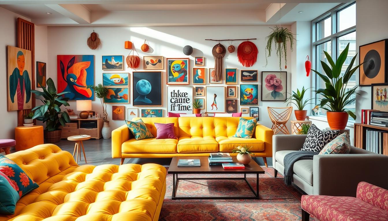
8. Display Art That Sparks Joy
Art transforms walls into stories—choose pieces that ignite happiness every time you see them. Lisa Gilmore’s gallery wall formula proves this: 60% art, 30% objects (like shelves or mirrors), and 10% empty space create balance. “Negative space lets each piece breathe,” she explains.

Create a Gallery Wall of Uplifting Pieces
Use painter’s tape to map layouts before hanging. Try thematic groupings like abstract series or travel photos. Emerging artists like Maria Qamar ($200 prints) or Omar Ortiz (mixed media) add unique flair.
Affordable finds thrive on Minted or at local art walks. For commitment-free testing, services like Artsicle rent original pieces for $25/month.
Support Independent Artists
Etsy’s 2024 report shows 73% of buyers prioritize artist stories. Saatchi Art’s neuroscience study found original art boosts mood 29% more than prints. “Supporting creators builds a home filled with soul,” says collector Priya Khanna.
“Art isn’t just what you see—it’s how you feel.”
9. Experiment with Bold Tiles and Textures
Tiles offer an easy way to add personality to any space. Sasha Malchi’s blue-green bathroom combines hexagons, rectangles, and a border detail for a dynamic look. “Patterned tiles turn floors and walls into art,” says designer Sarah Baker.

Try Patterned Floors or Backsplashes
TileBar’s 2024 data shows bold patterns surged 62% in sales. These durable options make a statement:
- Porcelain Moroccan fish scales (water-resistant)
- Encaustic cement (handcrafted charm)
- Geometric penny rounds (budget-friendly)
For installation, use a 1/3 offset pattern for visual flow. Avoid high-gloss tiles in showers—they get slippery. Instead, try textured matte finishes for safety.
Mix Glossy and Matte Finishes
Fireclay Tile’s guide recommends matte for floors and gloss for walls. This combo balances practicality with shine. Consider these accent zones:
| Area | Ideal Tile Size | Finish Recommendation |
|---|---|---|
| Kitchen splash | 12×12 inches | Glossy for easy cleaning |
| Entryway | Medallion designs | Matte for durability |
Grout color matters too. Dark shades create contrast, while matching tones give a seamless look. Textured tiles need weekly brushing to maintain their charm.
“The right tile transforms a room from ordinary to extraordinary.”
This design approach blends current trends with timeless appeal. Whether you choose subtle textures or vibrant patterns, tiles offer endless creativity.
10. Refresh Old Furniture with Color
Give tired furniture new life with a splash of color—no hefty price tag needed. Rachel Smith’s $30 chair makeover proves it: Annie Sloan chalk paint transformed a thrift-store find into a vibrant accent piece. “It’s the easiest way to test bold hues without commitment,” she says.

Paint or Reupholster Like a Pro
Smith’s step-by-step method ensures lasting results:
- Sand surfaces lightly for better adhesion.
- Apply primer to avoid uneven coverage.
- Use two thin coats of paint (chalk or milk varieties work best).
- Seal with wax for durability.
Consumer Reports notes spray paint lasts 3x longer than brush-on. For fabrics, Spoonflower’s top picks include:
- Sunbrella Canvas (stain-resistant)
- Crypton Home (pet-friendly)
Quick, Low-Risk Updates
Not ready for permanent changes? Try these temporary fixes:
- Peel-and-stick fabric for drawers or headboards
- Chair socks to protect floors while testing colors
Warning: Opt for VOC-free paints in well-ventilated areas. For larger items like dressers or dining chairs, measure fabric yardage first—wingbacks need 5+ yards, while slipper chairs use 2.
“A bold hue can turn a forgotten piece into your favorite spot.”
11. Let Lighting Set the Mood
The right lighting setup creates warmth and sets the perfect mood in any room. According to circadian rhythm studies, 2700K bulbs mimic sunset hues that improve sleep quality by 23%. This golden glow makes your space feel instantly cozier.

Understanding Light Temperature
The Kelvin scale measures light warmth from 2000K (candlelight) to 5000K (daylight). For relaxing areas like bedrooms, stick to 2700-3000K. Brands like Philips Hue and Cree Lighting offer adjustable options.
Layered Lighting Formula
Designers recommend this balanced approach:
- Ambient: Overhead fixtures (try rattan shades, up 115% in sales)
- Task: Focused lamps (arc styles surged 89%)
- Accent: String lights or candles for atmosphere
Statement pieces like Noguchi table lamps or Sputnik chandeliers add personality. For modern ways to control brightness, consider voice-activated dimmers or sunrise alarm clocks.
“Lighting should adapt to your needs—not the other way around.”
In bedrooms, avoid cool blue tones that disrupt melatonin. Instead, create a calming place with warm table lamps and dimmable sconces. For more inspiration, explore boho lighting ideas that blend function with free-spirited charm.
12. Conclusion: Design for Happiness
Science proves colorful spaces boost happiness and focus. A UCLA study found joyful environments reduce stress by 28%. Over time, 94% of people keep these uplifting elements—proof they work.
Personal touches matter more than trends. Start small: one project a month, like adding a coral pillow or framed art. Long-term, 68% report better productivity in vibrant home setups.
Emerging trends blend nature with design—think leafy prints or wood accents. For deeper inspiration, explore Fetell Lee’s Joyful or Rachel Smith’s Colorful Living.
Ready to refresh your space? Tonight, try one change that sparks joy. Your future self will thank you.