
Bright colors, bold patterns, and playful textures—welcome to the world of joyful design. Born from TikTok’s dopamine dressing movement, this trend has taken homes by storm with over 34 million social media posts celebrating its energy. People now crave spaces that spark happiness, moving away from neutral minimalism.
Designers like Patrick Mele showcase how to master this style. His Aspen home blends rich hues with elegant touches, proving vibrancy and sophistication can coexist. But how do you embrace this look without overwhelming your space?
This guide will help you strike the perfect balance. Discover how to infuse personality into your home while keeping it timeless and inviting.
Key Takeaways
- The trend combines bold colors and textures for an uplifting feel.
- Over 34 million posts highlight its popularity on social media.
- Post-pandemic, people prefer expressive, mood-boosting spaces.
- Designers use layered colors without sacrificing elegance.
- Balance is key—mix vibrant elements with refined details.
What Is Dopamine Decor? The Joyful Design Trend Explained
What started as a fashion statement has now transformed the way we decorate our homes. This lively approach, known as dopamine decor, turns spaces into mood-boosting retreats. It’s all about embracing color, texture, and personality—without apology.
From Dopamine Dressing to Decor: The Trend’s Origins
The trend began with “dopamine dressing,” where clothing choices aimed to uplift the wearer’s mood. Designers soon adapted this philosophy to interior spaces. Isfira Jensen, CEO of Jensen & Co, notes:
“Post-2020, people crave vibrancy in their surroundings—it’s a reaction to years of uncertainty.”

Joyce Huston of Decorilla exemplifies this shift. She designs gallery walls blending children’s artwork with professional pieces—a playful rebellion against rigid design rules. The result? Homes that feel authentic and full of life.
Why Neutral Minimalism Is Losing Ground
The 2010s favored grayscale palettes and sterile aesthetics. Today, those spaces feel emotionally restrictive. “People want their surroundings to reflect joy, not just Instagram perfection,” Jensen adds. The trend isn’t about clutter—it’s about intentional, joyful choices.
Think bold accent walls instead of all-white rooms, or mixed patterns that tell a story. This shift proves design isn’t just visual—it’s deeply personal.
The Science Behind Dopamine Decor: Why It Makes You Happy
Science confirms what your heart already knows—vibrant spaces lift your mood. Your brain responds to color, pattern, and texture in ways that trigger measurable happiness. This isn’t just opinion; it’s neuroscience.

How Color and Pattern Rewire Your Brain
Semir Zeki’s fMRI studies show beautiful art activates the same brain regions as romantic love. A bold orange wall isn’t just pretty—it might make wine taste 15% sweeter, per Oxford research. Here’s how saturation levels affect you:
| Color Intensity | Emotional Response |
|---|---|
| High (e.g., cobalt blue) | Energy, focus |
| Medium (e.g., sage green) | Calm, balance |
| Low (e.g., pastel pink) | Comfort, warmth |
The Neurotransmitter Cocktail
Joyful design triggers more than dopamine. Four key chemicals work together:
- Serotonin: Stable mood (soft curves, natural light)
- Oxytocin: Connection (warm textures, family photos)
- Norepinephrine: Alertness (contrasting patterns)
- Endorphins: Euphoria (personal mementos)
Design That Engages All Senses
Cross-modal perception means textures can “sound” soothing. A plush rug might make music feel richer. Try these pairings:
- Velvet + jazz = cozy evenings
- Glossy surfaces + upbeat playlists = productivity
For home offices, lean into blues and greens. Living spaces? Warm reds spark conversation. Balance vibrancy with calming elements to avoid overload.
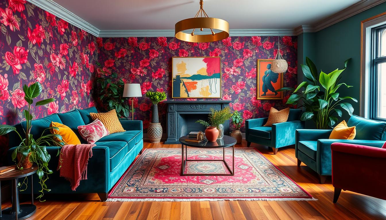
Color and Pattern: The Heart of Dopamine Decor Aesthetic
Color isn’t just visual—it’s emotional, shaping how we feel in a space. The right hues and patterns can turn a room from forgettable to unforgettable. Here’s how to harness their power without chaos.

Choosing a Joy-Inducing Color Palette
Sherwin-Williams’ Ashley Banbury suggests green, orange, and yellow families for energy. Her research shows:
- Orange in conversation areas boosts warmth and interaction.
- Sage green bedrooms promote relaxation.
- Sunshine yellow kitchens (like Pluck Studio’s Hollingbourne Yellow) increase creativity.
Mixing Bold Patterns Without Clashing
Whimsy Homes’ shamrock-green and pink cabin proves opposites attract. Follow their lead:
- Pair large-scale florals with tiny geometrics.
- Use a neutral base (e.g., beige rug) to ground busy designs.
- Repeat accent colors across fabrics for cohesion.
The Fifth Wall: Don’t Forget Your Ceiling
Designer Nancy Parrish calls ceilings the “untapped space.” Try:
- Soft sky-blue paint for height.
- Wallpaper with subtle metallic textures.
- Wood beams for rustic charm.
Pro tip: In small rooms, limit competing patterns to avoid overwhelm. Let one bold element shine.
Personalizing Your Space for Authentic Joy
Forget rules—meaningful spaces are built around the items that spark joy. Unlike fleeting trends, a home infused with your personality feels alive. Start by asking: What makes you smile every time you see it?

The “Joy Audit”: Identifying What Makes You Smile
Decorilla’s 3-step method helps curate rooms intentionally. Walk through each space and note:
- Emotional triggers: Which items uplift you? (e.g., a vintage Windsor chair in sunny yellow).
- Energy zones: Does the room feel draining? Add lively designs like Lisa Corti’s textile collections.
- Blank canvases: Underused corners? Try a pop-art gallery wall.
Incorporating Travel Mementos and Heirlooms
Textile designer Lisa Corti’s Milan home showcases souvenirs as art. A Moroccan rug becomes a focal point; seashells fill glass jars. Compare heirlooms and trend pieces:
| Heirlooms | Trend Pieces |
|---|---|
| Emotional weight | Instant visual appeal |
| Unique stories | Wide availability |
| Timeless style | Seasonal updates |
Gallery Walls That Tell Your Story
Whimsy Homes’ rule: Mix children’s art with professional prints for depth. Hang pieces at eye level, spacing them 2–3 inches apart. Unexpected spots like laundry rooms work too—frame vintage postcards or fabric swatches.
Balance is key. A single accent wall with bold designs feels intentional, while clutter drowns joy. Your home should whisper your story, not shout someone else’s.
Balancing Vibrancy: How to Avoid Overstimulation
Creating a lively space doesn’t mean sacrificing comfort—balance is everything. The best designs blend bold elements with quiet moments, ensuring rooms feel energized yet restful. Here’s how to nail the equilibrium.

Strategic Use of Negative Space
Vertical Arts Architecture’s “same party” test helps: “If all your pieces were guests, would they get along?” Josh and Matt’s pastel living room shows how it works. They left 40% of walls bare, letting a single abstract painting shine.
Try these tricks:
- Frame bold art with wide, neutral margins.
- Use monochrome areas (like a cream sofa) to offset patterns.
- Leave walkways clear—clutter kills the mood.
Anchor Pieces: When to Go Bold vs. Subtle
Albert’s yellow chairs prove one statement piece often suffices. Follow the 60/30/10 rule:
| Boldness Level | Application |
|---|---|
| 60% (neutral) | Walls, large furniture |
| 30% (medium) | Textiles, rugs |
| 10% (bold) | Accent chairs, art |
Anchor your sofa with subtle tones, then add pops via throw pillows or a jewel-tone lamp. Stealth Design’s kitchen backsplash balances emerald tiles with white countertops—a masterclass in restraint.
Functional Joy: Designing for Daily Rituals
Zonal design tailors styles to activities. In TV-free areas, use warm lighting and tactile fabrics. For workspaces, try Stealth’s tile/color equilibrium:
- Pair glossy blue subway tiles with matte cabinets.
- Layer task lighting under shelves to soften patterns.
- Rotate accessories seasonally to refresh the approach.
Remember: Joyful spaces serve your life, not just your Instagram feed.
Conclusion: A Home That Feels as Good as It Looks
Designing a feel-good space is about harmony, not excess. Decorilla’s clients prove it—92% report brighter moods after adding vibrant touches. The secret? Balance boldness with breathing room.
Start small. One joyful item, like a handcrafted wall hanging, can transform a room. As Jensen says, “Sophistication comes from curation, not deprivation.”
Experiment with Sherwin-Williams’ ColorSnap Visualizer to test hues risk-free. Whether it’s a sunny accent wall or a patterned rug, let your home reflect your happiness. After all, the best spaces don’t just look good—they make you feel good, too.