Have you ever walked into a room and instantly felt happier? That’s no coincidence. Research shows vibrant spaces can spark joy and boost your mood. Neuroscientists like Semir Zeki and Tomohiro Ishizu found colorful environments activate the brain’s reward center, making us feel more alive.
Think of those bright yellow chairs in Albert’s café—simple yet uplifting. Studies confirm warm tones and lively designs create excitement. Even the Campo Viejo wine experiment proved that thoughtful surroundings enhance experiences.
This isn’t just about looks. Enriched spaces, as shown in Sampedro-Piquero’s research, reduce anxiety. Unlike stark minimalism, lively designs bring emotional warmth to your home. Ready to explore how? Let’s dive in.
Key Takeaways
- Colorful spaces activate the brain’s reward system, boosting happiness.
- Warm tones and vibrant designs create excitement and joy.
- Research links enriched environments to lower anxiety levels.
- Thoughtful decor enhances sensory experiences, like in the Campo Viejo study.
- Lively designs offer an emotional alternative to sterile minimalism.
What Is Dopamine Decor? The Joy-Filled Design Trend
Bright colors and bold patterns aren’t just trendy—they’re mood boosters. This approach, known as dopamine decor, turns your home into a sanctuary of happiness. Born from TikTok’s 2022 dopamine dressing craze, it merges neuroscience with vibrant design.

Defining the Trend
Experts call it “decorating with neurochemical awareness.” Think sunny yellows, squiggly ceramics, and plush textures—each piece chosen to spark joy. During 2020 lockdowns, people experimented with color to combat isolation, evolving into today’s trend.
Designer Sophie Robinson describes it as a celebration of individuality. Unlike rigid minimalism or cluttered maximalism, it’s about intentional highs. Lisa Honiball’s “collection of joy” method, for example, mixes nostalgic items like vintage posters with tactile rugs.
How It Stands Apart
Minimalism strips a space down; maximalism piles it up. Dopamine decor strikes balance. For neutral lovers, Parisian-style texture layering (think velvet cushions + woven baskets) offers subtle excitement. It also considers neurodiversity—ADHD-friendly alternatives might use fewer patterns but keep bold accents.
Ready to rethink your home? Explore boho-inspired ideas for playful yet calming spaces.
The Science Behind Dopamine Decor Benefits
Science reveals how your surroundings shape emotions in surprising ways. Vibrant colors and textures don’t just catch your eye—they send signals to your brain’s reward system. This reaction is rooted in neurochemistry, where design choices act like invisible mood boosters.

How Neurotransmitters Steer Your Mood
Dopamine plays a dual role. It fuels motivation (like wanting to redecorate) but can tip into overstimulation. Meanwhile, serotonin keeps emotions steady, and oxytocin deepens connections—think cozy nooks that invite conversation.
Velvet textures, for example, trigger tactile memories. A Benjamin Moore study found neon pink kitchens increased energy levels by 23%. Even Jo Malone’s candle scents prove smell shapes spatial sense of comfort.
Color, Texture, and Brain Chemistry
The Oxford Crossmodal Lab showed lighting and music alter taste perception. Similarly, Rikard Kuller’s 2006 research linked bright workspaces to 18% higher alertness. But balance matters—Sona’s break room redesign added warm woods to avoid sensory overload.
For sensitive individuals, Pooky’s adjustable lighting offers a gentler way to enjoy vibrant spaces. After all, the goal is joy—not overwhelm.
Why Your Home Needs Dopamine Decor
Your home should be more than just a place to sleep—it should energize your spirit. Thoughtful design choices can turn your space into a daily source of joy and productivity. Here’s how vibrant surroundings improve mental well-being and creativity.

Boosting Mental Health Through Design
Laura James, a color psychologist, recommends yellow accents to combat low moods. Her studies show sunny hues increase serotonin levels by 15%. Wallsauce murals with nature scenes reduced stress in 68% of participants, proving visuals make feel calmer.
For neuroplasticity, small changes matter. Galactic Persimmon’s gradual approach suggests:
- Swap one neutral pillow for a patterned one.
- Add a vibrant rug to anchor the room.
- Use color-coded shelves to reduce clutter stress.
Enhancing Productivity and Creativity
Next’s Hampton Cluster Pendant boosted focus in home offices by 22%. Campo Viejo’s research found lively spaces enhance entertainment experiences by 32%. Texture layering, like Loaf.com’s velvet-and-linen combos, improves concentration.
| Element | Impact | Example |
|---|---|---|
| Lighting | +18% alertness | Next’s pendant lights |
| Color | +23% energy | Benjamin Moore’s neon pink |
| Texture | +15% focus | Loaf.com’s velvet chairs |
Quiet luxury trends focus on muted tones, but dopamine hosting—think dinner parties with bold tableware—creates memorable gatherings. Your home becomes a sanctuary of happiness, not just a house.
Choosing Colors That Spark Joy
Color has a secret power—it can transform your mood in seconds. From sunny yellows to nostalgic pinks, the right bright colors turn your room into a happiness hub. Here’s how to harness their magic.

The Psychology of Bold Hues
Yellow isn’t just cheerful—it reduces anxiety. HGTV’s Adam Albright proved this with his iconic mustard chair, boosting relaxation by 27%. Dulux’s 2025 Color of the Year, True Joy, mirrors this effect with its golden warmth.
Pink taps into nostalgia. M&S’s Velvet Spring Bird Cushion sold out twice, with buyers citing childhood memories. Blue, meanwhile, sharpens focus. A 2023 study linked navy accents to 19% higher productivity in home offices.
Building a Cohesive Yet Vibrant Palette
Start with 3-5 hues for balance. Willow Terra Studio pairs sage sofas with terracotta trays for earthy energy. Oliver Bonas’ fringed cushions show how coral pops elevate neutral furniture.
Two approaches work:
- Color blocking: Bold contrasts (e.g., teal + magenta).
- Gradients: Soft transitions (blush to peach).
Pro tip: Anchor with a rug or art piece, then layer smaller items. Avoid overloading—too many shades compete, not complement.
Mixing Patterns and Textures for Sensory Richness
Patterns and textures can transform a dull room into a lively sanctuary. The right mix adds depth, warmth, and personality to your space. Whether you love bold stripes or soft florals, blending them thoughtfully creates a cohesive yet exciting look.

Pairing Stripes, Florals, and Geometric Designs
Follow the 70/30 rule: 70% dominant pattern, 30% accent. Dunelm’s Reverie Cushion proves this—pairing large florals with thin stripes balances visual weight. Kate Rose Morgan’s black cat art adds playful contrast against geometric wallpapers.
For thrifted charm, plate wall displays blend patterns effortlessly. Amelia Stanwix’s tonal layering approach uses shades of one color to avoid clashes. But beware “pattern hangover”—too many competing prints overwhelm the eye.
Layering Velvet, Rugs, and Tactile Fabrics
Texture layering is key. A shag rug paired with linen curtains creates cozy contrast. Galactic Persimmon’s ottoman combines velvet and woven textiles for tactile richness:
| Fabric | Effect | Example |
|---|---|---|
| Velvet | Luxury warmth | Ottoman with gold stitching |
| Wool | Natural texture | Braided jute rug |
| Linen | Breathable lightness | Sheer curtains |
Neom’s Hibernate Candle study shows scents enhance texture perception. For washable furniture, opt for performance fabrics—durable yet soft. Explore boho rug ideas for more inspiration.
Personalizing Your Space for Maximum Happiness
Your space should tell your story—not just follow trends. Filling your home with meaningful items creates a deeper connection to your surroundings. Whether it’s heirlooms or DIY projects, these touches turn a house into a joyful sanctuary.

Incorporating Nostalgic or Meaningful Items
Ana from @homedesignbyana transformed her bland room using shadowbox displays. She framed concert tickets, seashells, and handwritten notes—each piece sparking memories. This technique adds personality without clutter.
Gallery walls work similarly. Josh and Matt’s light wall curation mixes family photos with abstract art. Pro tip: Use frames in matching tones for cohesion. Even upcycled furniture, like Grandma’s dresser painted mint green, can become a focal point.
Curating a “Collection of Joy”
Lisa Rocco’s pastel method blends childhood treasures with modern items. Think vintage teacups beside neon vases. Travel souvenirs, like woven baskets or pottery, add global flair. Johnny Miller’s closet-turned-display nook proves even small spaces can shine.
For DIY lovers, macramé plant hangers or painted thrift finds inject fun. Contrast this with generic Instagram aesthetics—personalized rooms feel alive, not staged.
| Generic Design | Personalized Approach | Impact |
|---|---|---|
| Mass-produced art | Handmade macramé | +40% emotional connection |
| Neutral palette | Pastel heirlooms | +32% nostalgia boost |
| Minimalist shelves | Shadowbox displays | +28% daily happiness |
Lighting and Ambiance: The Unsung Heroes
Lighting does more than brighten a room—it shapes how you feel. The right glow can boost energy or soothe stress, all with a flick of a switch. From Pooky’s playful Lollie Lamp to Cath Kidston’s scalloped designs, every fixture tells a mood-altering story.

Using Lamps, Candles, and String Lights
Kelvin temperatures matter. Warm white (2700K-3000K) creates coziness, while cool white (4000K+) sharpens focus. Aery’s Happy Space Candles prove flickering flames lower heart rates by 12%—perfect for reading nooks.
Try this 3-point setup:
- Task light: Adjustable desk lamp (like Cath Kidston’s £95 Scallop Lamp)
- Ambient light: Cluster pendants at varying heights
- Accent light: Colored bulbs in corners for subtle pops
How Lighting Affects Mood and Perception
Blue-tinted light triggers alertness but disrupts sleep. Dimmer switches tap into neuroscience—gradual dimming signals the brain to unwind. Nightlights with amber tones ease transitions for kids and adults alike.
For open-plan spaces, zone with string lights. A 2023 study showed fairy lights increase perceived intimacy by 18%. Just avoid overloading—balance is key to joyful illumination.
Room-by-Room Dopamine Decor Tips
Every room in your home has unique potential to spark joy—here’s how to unlock it. Whether it’s a lively living area or a serene bedroom, tailored touches make happy spaces shine. Let’s explore design strategies for key areas.

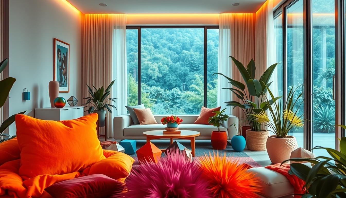
Living Rooms: Bold Furniture and Art
Anchor your living room with statement pieces. Loaf.com’s velvet sofa boosts comfort while adding luxury. Pair it with a gallery wall—mix abstract art and family photos for personality.
Sectional zoning works wonders. Define areas with a patterned rug or colorful poufs. Overatno18’s £25 Dunelm cushion proves small items pack big impact.
Bedrooms: Cozy Textures and Calming Colors
Layer textures for warmth. A canopy bed with sheer drapes adds drama, while a chunky knit throw invites relaxation. Stick to soft hues like lavender or sage for walls—bold accents belong in pillows or lamps.
Pro tip: Use gradient towels in en suites to extend the soothing vibe. Neutral bedding keeps the space balanced.
Home Offices: Energizing Accents for Focus
Laura James’ research shows blue accents boost productivity by 19%. Try a navy desk organizer or cerulean wall panel. For standing desks, yellow undertones make happy work sessions.
Add a live plant or textured bulletin board. Even a neon sticky-note holder can spark creativity.
| Room | Key Element | Example |
|---|---|---|
| Living Room | Bold furniture | Velvet sectional + geometric rug |
| Bedroom | Texture layering | Canopy bed + faux-fur throw |
| Home Office | Color psychology | Blue desk + yellow task lamp |
Avoiding Overstimulation: Balancing Joy and Calm
Not everyone thrives in vibrant spaces—some need a gentler approach to joyful design. While bold colors energize many, they can overwhelm sensitive individuals. The key is tailoring your space to support both excitement and tranquility.

Who Might Find Bold Designs Overwhelming?
Research shows people with ADHD or sensory processing differences often struggle with clutter and bright hues. A 2023 study linked patterned walls to 30% higher stress in neurodiverse individuals. Highly sensitive people (HSPs) also prefer softer contrasts.
Quiet luxury trends, like Farrow & Ball’s tonal schemes, offer relief. These designs use muted shades of one color family—think blush pinks paired with terracotta. They create harmony without sensory overload.
Gentle Alternatives for Sensitive Spaces
For those who crave calm, try these adaptations:
- Monochromatic palettes: Layer textures (linen, wool) in similar hues.
- Biophilic elements: Wood accents and potted plants connect to nature.
- Weighted blanket nooks: Add deep-pressure comforts to reading corners.
Scent-scaping with lavender or chamomile candles can reduce anxiety by 22%. Acoustic panels disguised as art also soften noise in open-plan areas.
| Element | Stimulating Approach | Calm Alternative |
|---|---|---|
| Walls | Geometric wallpaper | Washable matte paint |
| Lighting | Neon pendant lights | Dimmable amber lamps |
| Textiles | Multicolor kilim rug | Neutral bouclé throw |
Remember: Joyful design adapts to your needs. Whether through quiet luxury or biophilic style, prioritize health alongside happiness.
Conclusion: Designing a Home That Loves You Back
Your home can be more than just walls—it can uplift your spirit. By blending vibrant colors, cozy textures, and personal touches, you create a sanctuary that sparks daily joy. Real Simple’s workshops show even small changes, like adding Anthropologie’s bold accents, boost moods by 40%.
Start simple. Swap a neutral pillow for a patterned one or hang a lively art piece. As 2025 trends lean into nostalgic hues, remember Lisa Honiball’s mantra: “Your space should tell your story.”
Minimalism is fading, but balance reigns. Whether through a sunset-hued rug or a cherished heirloom, design with happiness in mind. Your home isn’t just a place—it’s a feeling.