Looking to brighten up your home? A fresh design trend is making waves by blending color psychology with emotional well-being. This approach creates spaces that spark happiness naturally.
From bold neons to warm earthy tones, this movement adapts to any style. Farrow & Ball’s latest terracotta shades show how versatile it can be. Designers like Ellen Cumber note clients crave spaces that feel uplifting yet personal.
The best part? There are no strict rules. RJ Living’s Bree Steele puts it simply: “Create a space that feels authentic for you.” Whether through color blocking or mixing textures, the goal is to craft rooms that bring comfort and delight.
Key Takeaways
- This trend focuses on mood-boosting interiors through smart color choices.
- It works with any style, from bold to subtle earthy palettes.
- Personalization matters more than following strict design rules.
- Texture mixing and functional boldness add depth to spaces.
- Joyful homes adapt to individual tastes while enhancing daily life.
What Is Dopamine Decor? A Mood-Boosting Design Trend
A new wave of design blends science and style to create uplifting interiors. This trend, often called dopamine decor, uses vibrant colors and playful patterns to activate the brain’s reward system. Unlike stark minimalism, it embraces bold hues while keeping lines clean and intentional.

Why Joyful Spaces Matter
Research shows that 73% of people now search for “happy home” ideas online. The Appreciation Project’s Natasha Lyon suggests balancing bold colors with creamy neutrals: “Earth tones ground the energy, letting brighter shades shine.” Studio Far West’s coral bathroom case study proves even small pops of color can transform a space.
The Science Behind Dopamine and Design
Visual stimuli trigger dopamine release in the brain’s ventral tegmental area. Yellow wavelengths, for example, boost mental activity—a finding supported by Roisin Lafferty’s red cabinetry study. Farrow & Ball’s Joa Studholme adds: “Terracotta is the ultimate dopamine color—warm but never overwhelming.”
| Feature | Dopamine Decor | Minimalism |
|---|---|---|
| Color Palette | Bold, layered hues | Neutral monochromes |
| Textures | Mixed materials (velvet, rattan) | Smooth, uniform surfaces |
| Mood Goal | Energetic yet balanced | Calm and restrained |
Designer Liv Waller of Yellow London notes: “Pattern is the instant mood-booster.” But Sarah Hargrove warns against overstimulation—pair whimsical wallpapers with sophisticated furniture for harmony.
Start Small: Easy Ways to Dip Into Dopamine Decor Inspiration
Want to refresh your space without a full makeover? The best way to experiment is to start small. Swap a few accessories or paint one wall to test the waters. As RJ Living’s Bree Steele advises: “Try pretty pillows or cool artwork first—they’re low-risk but high-impact.”

Begin with Accent Pillows or Artwork
Throw pillows or framed art instantly add personality. Etsy’s handmade covers or Society6’s removable decals let you play with patterns temporarily. For a curated look, NativeHouse Photography suggests gallery walls with local artists’ work.
Budget tip? Upcycle thrift store finds with Annie Sloan chalk paint. A turquoise bookshelf—like Phil Crozier’s—proves one bold piece can anchor a room.
Try an Accent Wall for Instant Impact
Reena Sotropa’s coral-and-white patterned wall shows how walls can transform a space. Arterberry Cooke’s peel-and-stick wallpapers make updates easy. “Paint furniture before committing to walls,” says The Crafted Life’s Rachel Smith.
| Change Type | Best For | Commitment Level |
|---|---|---|
| Pillows/Art | Renters or cautious updaters | Low (swap anytime) |
| Accent Wall | Homeowners | Medium (requires prep) |
| Painted Furniture | Budget-friendly refresh | Low (reversible) |
Why start small? A Hammonds study found 42% redo full-room color schemes within 6 months. Small wins build confidence for bigger projects—without regret.
Experiment with Patterns and Bold Colors
Ready to add excitement to your space? Mixing bold colors and dynamic patterns creates rooms that feel alive. From geometric floors to floral walls, this approach lets you play with design while keeping it cohesive.

Unexpected Pairings That Work
Sasha Malchi’s peacock wallpaper paired with saffron paint proves contrast is key. Yasu Home’s Kate Anlyan agrees: “Mix checkered rugs with plaid throws—the trick is varying scales.” Abigail Jackson’s checkerboard kitchen floor shows how black-and-white tiles energize a neutral space.
- Use Pooky’s Bayou lamp (green lacquered wood) for a pop of shine.
- Follow the 60-30-10 ratio: 60% dominant pattern, 30% secondary, 10% accent.
- Pantone’s Color Bridge system helps clashing hues feel intentional.
Wallpaper as a Statement Maker
Graham & Brown’s collection turns walls into art. For renters, Tempaper’s removable murals offer commitment-free flair. Farrow & Ball’s Dead Salmon paired with Teresa’s Green creates depth without chaos.
| Pattern Scale | Best For | Example |
|---|---|---|
| Large (floral, abstract) | Accent walls | Arterberry Cooke’s wainscoting |
| Small (geometric, stripes) | Textiles, rugs | Checkered kitchen floors |
| Mixed | Layered look | Velvet cushions + rattan chair |
Balance is everything. Liv Waller’s yellow-and-navy office shows how grounding neutrals let bold colors shine.
Forget the Rules: Create a Space That Feels Authentically You
Rules are meant to be broken—especially in design. Your home should mirror your personality, not a Pinterest board. Jenny Johnston Interiors’ ruby red laundry room proves bold choices pay off.

Love One Color? Go All In
Monochromatic schemes create harmony. Lonika Chande’s all-teal dining room with brass accents shows how depth comes from texture, not contrast. Clare Paint’s Mood Ring collection simplifies matching shades.
Debunk the myth: “Blue isn’t energizing.” Roisin Lafferty’s navy study reveals darker hues can uplift when paired with warm metals. Jungalow’s Color Therapy Room Makeover contest highlights fearless single-color spaces.
How to Trust Your Instincts
Designer Ellen Cumber says: “Your home should hug you back.” Try The Appreciation Project’s *color journaling*—note which hues spark joy. Anthropologie’s maximalist furniture line encourages mixing eras fearlessly.
For neurodivergent-friendly spaces, Lisa Gilmore Design blends traditional and modern lighting. Tools like 3D room visualizers build confidence before committing.
| Design Approach | Traditional | Instinct-Driven |
|---|---|---|
| Color Palette | Neutrals + 1 accent | Unapologetic monochromes |
| Furniture Style | Matching sets | Eclectic mixes (e.g., rattan + velvet) |
| Goal | Broad appeal | Personal sense of belonging |
Strive for Balance in Your Joyful Space
The secret to a vibrant yet calming space lies in thoughtful balance. Pair bold elements with neutral backdrops to create energy without chaos. Reena Sotropa’s walnut console against an emerald wall proves how warmth and vibrancy can coexist.

Mix Bold Elements with Neutral Backdrops
Ground daring choices with earthy tones. CB2’s travertine coffee table adds weight to colorful rooms, while Sostrene Grene’s striped pouffe demonstrates color anchoring. Designer Liv Waller notes: “A single neutral piece can tame a riot of hues.”
Layer textures for depth—try a bouclé chair atop a sisal rug with silk drapes. Emery Davis Photo’s terrazzo-meets-terracotta bathroom shows how materials add contrast. Avoid the “rainbow vomit” effect by using Benjamin Moore’s Historical Color palette for cohesion.
Natural Materials to Ground the Design
Organic elements bring serenity. Ferm Living’s cotton throws soften bold schemes, while rattan baskets add warmth. The Collective’s formula—vivid rugs + linen curtains—keeps rooms lively yet relaxed.
- Leave 30% space empty (“pause points”) to prevent overwhelm.
- Use the Plant Life Balance app to integrate greenery seamlessly.
| Element | Role | Example |
|---|---|---|
| Travertine | Grounding | CB2’s coffee table |
| Organic Cotton | Softening | Ferm Living throws |
| Rattan | Warmth | Storage baskets |
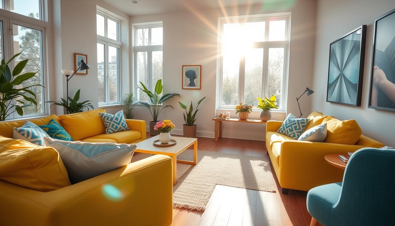
Dopamine Decor for the Living Room: Bold and Inviting
Your living room deserves to be as vibrant as your personality. This central space sets the tone for your entire home, making it the perfect place to experiment with joyful design. Whether you prefer subtle pops of color or full-spectrum energy, these approaches create welcoming environments.

Colorful Furniture and Gallery Walls
Make a statement with pieces that spark happiness. Burrow’s modular sofas in peacock blue prove that furniture can be both functional and fun. For smaller spaces, Joybird’s storage ottomans add hidden organization with velvet flair.
Walls become canvases with Minted’s “Joyful Abstracts” collection. Lisa Gilmore Design’s rotating gallery wall system lets you swap art seasonally. Remember to secure heavy frames with OOK Hercules hooks—safety enhances enjoyment.
- Urban Outfitters’ Projector Lamp casts color-shifting patterns for dynamic evenings
- Lulu and Georgia’s mustard velvet sectional adds warmth to neutral spaces
- Mix framed prints with woven wall hangings for tactile dimension
Symmetry for a Happy-Making Layout
Lonika Chande’s pink sofa arrangement shows how balance creates comfort. While perfect symmetry soothes, asymmetrical groupings feel more dynamic. The trick? Distribute visual weight evenly.
| Layout Style | Effect | Best For |
|---|---|---|
| Mirrored | Calming order | Formal spaces |
| Organic | Creative energy | Eclectic rooms |
Keep 36″ walkways clear per ADA guidelines—flow matters as much as look. Your living room should invite movement and connection, becoming the joyful hub of your home.
Dopamine Decor for the Bedroom: Playful Yet Peaceful
Your bedroom should be a sanctuary that sparks joy and calm. This private space deserves special attention—it’s where you start and end each day. The right mix of energy and relaxation creates a personal retreat.

Patterns That Energize Without Overwhelming
Yellow London’s palm print bed wall proves patterns can excite while maintaining order. The symmetrical design keeps the look cohesive. For custom options, Spoonflower’s duvet covers let you scale prints perfectly.
Follow Pantone’s 2024 Sleep Study recommendations for restful palettes. Pair vibrant accents with muted bases—like Farrow & Ball’s Pink Ground walls. This creates visual interest without sacrificing calm.
Soft Textures for a Cozy Feel
Layer soft textures for ultimate comfort. Parachute’s sage linen bedding forms a perfect base. Add Pottery Barn’s sunset ombré weighted blanket for gentle pressure.
Mix materials thoughtfully:
- Bamboo sheets for breathability
- Faux fur rug for plush warmth
- Bouclé throw pillows for tactile contrast
Lighting affects the room’s sense of harmony. Gantri’s bedside lamps provide flattering glow without harsh overhead lights. For blackout needs, The Shade Store’s drapes combine function with style.
Consider circadian rhythms when designing. Philips Hue’s sunrise simulation helps regulate sleep cycles over time. Your bedroom becomes both beautiful and biologically supportive.
Dopamine Decor for the Kitchen: Functional and Fun
The kitchen is the heart of the home—why not make it as lively as your gatherings? This space thrives on bold colors and clever contrasts, blending energy with everyday utility. From terracotta cabinets to mosaic backsplashes, the options are endless.

Bold Cabinets and Cheerful Backsplashes
Roisin Lafferty’s terracotta kitchen with marble counters proves warm hues feel inviting. For a bolder way to experiment, try Semihandmade’s DIY fronts in “Dopamine Red.” Pair with Rejuvenation’s brass hardware for a luxe finish.
Sasha Malchi’s blue-green zellige tile backsplash adds Mediterranean flair. Fireclay Tile’s recycled glass mosaics offer eco-friendly alternatives. “A vibrant backsplash anchors the room without overwhelming,” notes designer Liv Waller.
Balancing Color with Natural Materials
Ground bold colors with natural materials like travertine or rattan. The Farrow & Ball Card Room Green IKEA hack balances vibrancy with walnut open shelving. Heath Ceramics’ earthy dinnerware softens the look.
- Use Smeg’s pastel mixers as “appliance jewelry” for playful accents
- Keep upper cabinets neutral for resale flexibility
- Seal colored grout with Miracle Sealants’ 511 Impregnator
This balance of daring and organic elements creates a kitchen that’s both joyful and timeless. Your cooking space should reflect your personality—one colorful meal at a time.
Pro Tips from Designers to Nail the Trend
Top designers share their secrets for getting this trend right. From choosing the perfect hue to unexpected experiments, these strategies make joyful spaces effortless. Arterberry Cooke’s Barrett Cooke advises: “Start with saturated neutrals—they’re bold yet timeless.”

Choose a Favorite Color as Your Anchor
Pick one shade you love and build around it. Clare Paint’s Color Genius Quiz helps narrow options. Studio McGee’s 5-tone ceiling technique proves layering similar hues adds depth.
- Use Behr’s Color Studio app to visualize “color layering” in your space
- Benjamin Moore’s sample pots let you test shades risk-free
- Justina Blakeney’s mantra: “Your ceiling is the fifth wall!”
Paint the Ceiling for a Low-Stakes Experiment
The Crafted Life’s pink ceiling project shows how overhead color transforms a room. Sherwin-Williams’ Emerald collection offers durable matte finishes to avoid glare.
Renters can try Command Strip fabric panels—a no-commitment way to add overhead interest. As designer Liv Waller notes: “Ceilings are the ultimate surprise element.”
Conclusion: Embrace the Joy of Dopamine Decor
Colorful homes aren’t just pretty—they boost happiness and productivity. Studies show 68% of people thrive in vibrant spaces. Start small: swap pillows or paint one wall, then expand over time.
Remember, “Joy is personal,” says designer Lisa Gilmore. Seasonal updates—like Society6’s removable art—keep your home fresh. For deeper dives, explore boho decor ideas to blend styles seamlessly.
Ready to begin? Download our free design starter kit. As Rachel Mae Smith says, “Color is courage made visible.” Your space should spark joy every day—starting now.