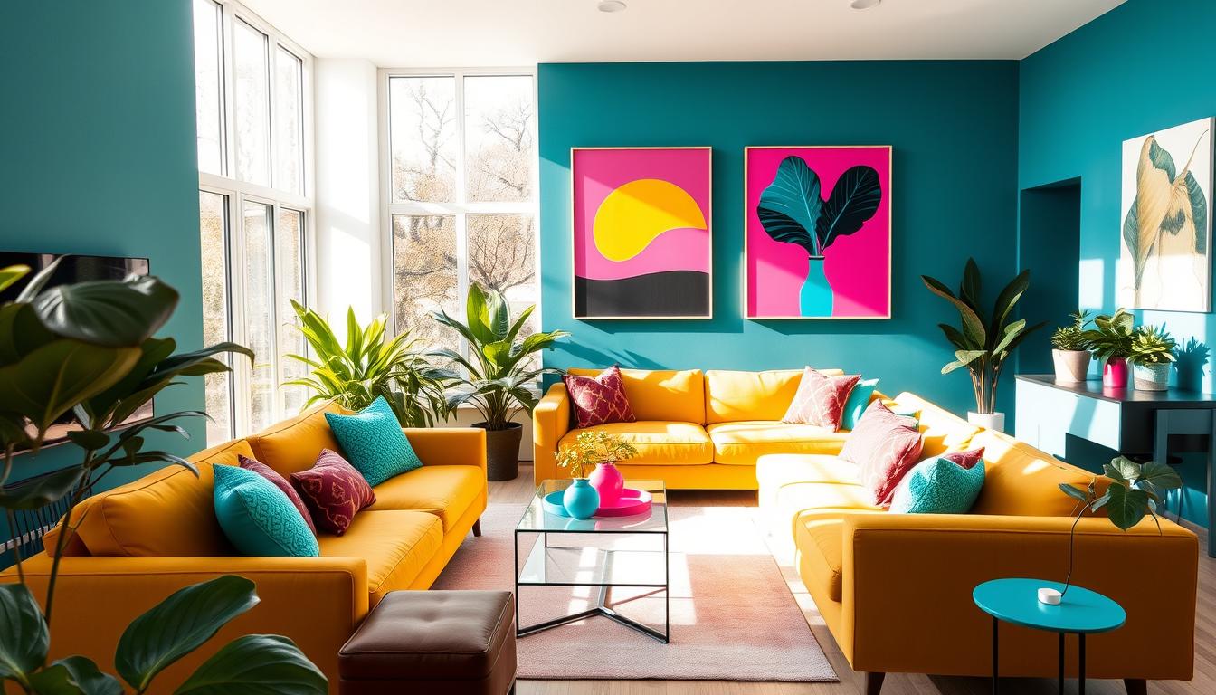
Imagine walking into a room that instantly lifts your mood—like slipping into your favorite cozy sweater. That’s the magic of vibrant, joyful spaces. This growing trend blends bold hues and playful patterns to create rooms that spark happiness.
Originally inspired by TikTok’s “dopamine dressing” movement, this design shift brings energy into home environments. Designers like Patrick Mele showcase the power of color-drenched walls, proving that bright spaces can transform daily life.
Experts like Isfira Jensen note a rising demand for emotionally uplifting rooms. After years of neutral palettes, people crave warmth and personality. As Joyce Huston observes, post-pandemic priorities now include creating spaces that truly feel good.
Key Takeaways
- Vibrant designs boost emotional well-being in living spaces
- The trend evolved from fashion into home styling
- Bright colors replace minimalist neutrals in modern interiors
- Social media drives its rapid popularity
- Experts link it to post-pandemic comfort needs
What Is Dopamine Decor? The Trend Redefining Home Happiness
Forget cookie-cutter aesthetics; today’s homes celebrate bold self-expression through color and texture. This movement, dubbed dopamine décor, throws out rulebooks and invites you to design your way. Think mismatched patterns, saturated hues, and pieces that tell your story.
From TikTok to Your Living Room: The Rise of Joyful Design
Born from fashion’s “dopamine dressing” trend, this style migrated to spaces as people craved environments that matched their vibrant wardrobes. TikTok catapulted it to the #6 spot in interior trends, with designers like Nancy Parrish reimagining ceilings as “fifth walls” for bold statements.

Decorilla’s gallery walls exemplify the shift—think framed concert tickets next to abstract art. “There’s no one-size-fits-all approach,” notes designer Briellyn Turton. “It’s about what makes you smile.”
Why Neutral Palettes Are Taking a Backseat
After years of minimalist grays, homeowners want personality. Kit Kemp’s Calypso tableware proves even small accents—like hand-painted citrus motifs—add reward. The result? Rooms that feel alive, not staged.
- Self-expression > perfection: Crooked frames and clashing prints are encouraged.
- Social media fuel: Instagram’s #ColorfulHome hashtag grew 40% in 2023.
- Accessible joy: Start with a single neon vase or polka-dot pillow.
The Science Behind Dopamine Decor Interiors
Neuroscience confirms what we’ve always felt: colorful spaces spark real happiness. Studies show vibrant designs activate the brain’s reward system, releasing a cocktail of feel-good chemicals. It’s not just about aesthetics—it’s biology.
How Your Brain Responds to Vibrant Spaces
fMRI scans by Semir Zeki and Tomohiro Ishizu reveal that viewing art and bold designs lights up the same brain regions as romantic love. The Oxford Crossmodal Lab found that combining colors, textures, and patterns creates a synergy—like pairing wine with music to enhance flavor perception.

Designer Lisa Corti’s Milan home exemplifies this. Her riotous prints and saturated hues trigger serotonin (for mood) and oxytocin (for comfort). Even William Jess Laird’s soft-pink kitchen taps into this, proving calming shades work differently but just as powerfully.
Neurotransmitters at Play: More Than Just Dopamine
While dopamine drives initial excitement, norepinephrine keeps you engaged—think of a neon accent wall that energizes. Textures like velvet or rattan boost oxytocin, creating a sense of safety. It’s a delicate balance, like a symphony in your brain.
Key takeaways:
- Color = Chemistry: Warm yellows spark serotonin; deep blues calm norepinephrine.
- Touch Matters: Textured throws or glossy ceramics activate sensory pathways.
- Personal Connection: Items with meaning (like travel souvenirs) amplify effects.
Key Elements of a Dopamine-Boosting Space
Your home should be a daily dose of happiness, starting with the right colours and textures. These design choices don’t just look good—they create an emotional connection, turning rooms into mood-lifting sanctuaries.

Color Psychology: Picking Hues That Spark Joy
Ashley Banbury of Sherwin-Williams suggests matching hues to room functions. Earthy oranges in kitchens encourage conversation, while soothing greens in home offices promote focus. Even laundry rooms benefit from cheerful yellows.
| Room | Recommended Color | Effect |
|---|---|---|
| Kitchen | Terracotta Orange | Stimulates social energy |
| Home Office | Sage Green | Enhances concentration |
| Laundry Room | Sunflower Yellow | Boosts motivation |
Pattern Clashing for Visual Energy
Mixing prints, like Kit Kemp’s Steccato and Blue Italian collections, adds dynamic energy. “Pair geometrics with florals for balance,” advises Nancy Parrish. The trick? Keep one color consistent to avoid chaos.
Textures That Invite Touch and Delight
Layering textures—like Jessica Viscarde’s rug technique—creates sensory depth. Try velvet throws for softness, rattan baskets for warmth, and metallic accents for shine. Each layer adds comfort and visual intrigue.
- Velvet: Instant luxury for sofas or pillows.
- Rattan: Natural warmth in storage or lighting.
- Metallics: Reflective surfaces amplify light.
Step 1: Conduct a “Joy Audit” of Your Home
Your home should reflect what makes your heart sing, not just what looks good in magazines. Start by walking through each room with fresh eyes. Ask: Which items genuinely make me smile? Keep these, even if they clash with your decor.

Identifying Items That Genuinely Make You Smile
Briellyn Turton’s “micro luxuries” concept proves small delights—like vintage matchboxes or a quirky waste bin—add daily joy. Display childhood memorabilia or travel souvenirs, as Jessica Viscarde suggests. These pieces tell your story.
Clive Lonstein’s Victorian kitchen showcases this perfectly. His mix of heirloom pottery and modern tools creates a space that’s uniquely his. “Foundation of design should be personal joy,” says Joyce Huston.
Letting Go of “Shoulds” in Design
Ditch “designer-approved” items that leave you cold. Instead, blend kids’ artwork with professional pieces for a space bursting with personality. Functional zones—like reading nooks—add joy without sacrificing practicality.
- The smile test: If an item doesn’t spark happiness, thank it and let it go.
- Mix high and low: Pair a gallery wall with vacation snapshots.
- Edit fearlessly: Rooms evolve as you do—keep only what serves you now.
Step 2: Color Drenching Done Right
Color can transform any space from dull to dynamic—here’s how to do it right. Unlike accent walls, colour drenching immerses a room in one cohesive palette, from walls to trim. Sherwin-Williams’ Ashley Banbury swears by the 60-30-10 rule: 60% dominant hue, 30% secondary, and 10% for pops of contrast.

Room-by-Room Color Recommendations
Match hues to a room’s purpose. Kitchens thrive with warm terracotta, while bedrooms benefit from calming lavender. Oberto Gili’s Milan home showcases how coral energizes a dining area without overwhelming.
| Room | Color Suggestion | Effect |
|---|---|---|
| Kitchen | Terracotta Orange | Encourages socializing |
| Bedroom | Lavender | Promotes relaxation |
| Home Office | Sage Green | Boosts focus |
When to Go Bold vs. When to Soften the Palette
Small spaces need balance: try peach instead of neon coral. Jensen recommends testing swatches at different times—morning light changes everything. For drama, paint ceilings or use textured accents to break up blocks of colour.
- Bold: Living rooms with emerald walls (like Kit Kemp’s frames).
- Soft: Bathrooms in powdery blue for serenity.
- Pro tip: Colour-block architectural niches for depth.
Step 3: Personalize With Meaningful Accents
Your walls should whisper your story, not just hold up the roof. This step is about curating things that reflect your journey—whether it’s a seashell from Bali or your grandma’s quilt. Intentional clutter beats sterile perfection every time.

Gallery Walls That Tell Your Story
Studio Brie’s eclectic arrangements prove gallery walls thrive on chaos-with-purpose. Mix frames—try pairing sleek metallic with chunky wood—for dynamic energy. Shadowboxes let 3D objects like vintage keys or concert stubs shine.
Rotate pieces seasonally to keep the art fresh. Kit Kemp’s Blue Italian border shows how a unifying color (like cobalt) ties mismatched designs together. “Woven elements add character,” says Jessica Viscarde—think macramé beside oil paintings.
| Frame Style | Material | Best For |
|---|---|---|
| Ornate | Gold | Vintage photos |
| Minimalist | Black Wood | Modern art |
| Floating | Acrylic | 3D objects |
Incorporating Travel Mementos and Heirlooms
Briellyn Turton’s salt shaker collection turns everyday things into displays. Ugly-but-meaningful items (like a child’s pottery) deserve spotlight too. Group heirlooms by theme—travel souvenirs on floating shelves, family recipes in a clip wall.
- Conversation starters: Place quirky items near seating areas.
- Layer textures: Hang a woven basket beside framed maps.
- Case study: Decorilla client used postcards as a kitchen backsplash.
Conclusion: Your Home Should Feel Like a Hug
Design isn’t just about looks—it’s about how a space makes you feel. Science proves vibrant colors and textures boost serotonin, turning rooms into mood-lifting sanctuaries. As Joyce Huston puts it, “Choose authentic joy over Instagram perfection.”
Let your home evolve with you. Swap accents seasonally or rearrange art to keep the energy fresh. Briellyn Turton advises: “Celebrate what resonates with you—not what’s trending.”
Remember: your space, your rules. Whether it’s a neon vase or a gallery wall of travel memories, prioritize happiness over rigid aesthetic rules. As Isfira Jensen says, “The best spaces feel deliciously good—like a warm embrace.”